Richard's Realm -Fall 17 - Fascinating Tech Magazine Archivee
Main menu:
Richard's Realm -Fall 17
Archived Issues > Autumn/Fall/Winter 2017 Issue
Richard's Realm
Want to go a little more in depth Richard is your man
In this issure WAKA WAKA, Epson Ultra Short Throw Projector, VR Showcase and Make it Real, Parallels 13
WAKA WAKA BASE 10 - Long term review
Richard follows up Peter's initial look at the Waka Waka from last issue with a real world adventure.
When Garry asked me to review a ‘Waka Waka Base 10’, I was half expecting to receive a Fozzie Bear toy with a decimal fixation. Instead, the non-descript brown box turned out to contain one of the most useful bits of eco-consumer technology I’ve come across in a while.
Muppet allusions aside, Waka Waka is a company specialising in solar powered torches and battery packs. The company makes much of its social conscience, with a foundation aimed at bringing light to regions of the world without electricity, and encourages customers to donate as well as purchasing the handy solar-powered gizmos.
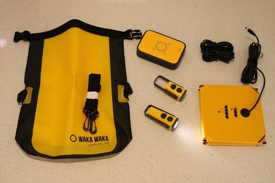
The Base 10 is a bundle of Waka Waka products that would appeal to anyone likely to be away from a power source for a few days, comprising a battery pack, solar array, a pair of torches and the cables necessary to connect everything together. In keeping with the eco-worthiness, the box is plain cardboard. However, the plastic packaging inside undermines things somewhat.
For my testing, I carried the product around over a British summer and on a US road-trip to see how the solar panel would fare beneath the intense sunlight of the southern states of the USA and under the flinty grey of a British summer sky.
The Battery

The Base 10 comes with a 10,000 mAh battery. Once fully charged, this battery should have enough juice to charge a number of devices (obviously depending on the device types). In my testing, I found the battery could recharge an iPhone 6 from near-death twice, as well as an iPad Mini, before needing to be recharged itself. This seems about right compared to other batteries I’ve tested. However, unlike other batteries, the Base 10 battery has been ruggedized to withstand the rigours of outdoor life (although Waka Waka are quick to point out that it is water resistant, NOT waterproof – so no skinny dipping with this battery pack).
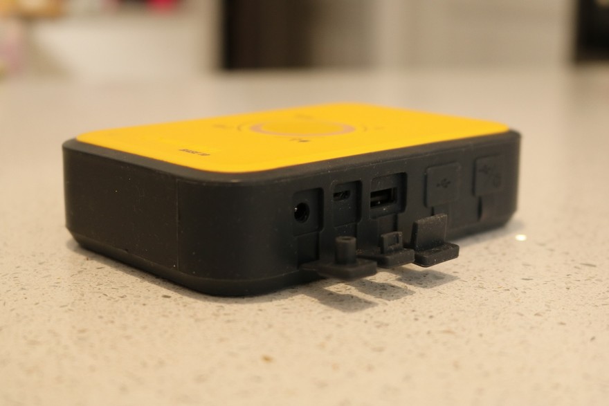
The ports on the battery are covered with rubber flaps to keep out dirt and moisture (something I appreciated while traipsing around a music and science festival in Cheshire) and these can be a little fiddly to open for those who like to keep their fingernails trimmed. Once open, the bad news begins, since this is a bit of an unintuitive device. Starting with the ports themselves: There are 3 USB ports, but only 2 can actually be used for charging. 1 is reserved for use by the torches that come in the pack (more on those later). Of the 2 available ports, 1 is ‘optimised’ for Apple products while the other is a normal USB port. In practice, my iPhone would only recognise the ‘optimised’ port while I was able to charge my camera from either. The visual cues for which port to use are pretty woeful and I have to admit that I find it an odd design decision on the part of Waka Waka. The other ports provide a socket to charge the battery itself via USB and another for connecting the solar panel.
The problems continue with the charge indicator on the big yellow face of the battery. A variety of colours (red, green, blue) indicate what the battery is doing (charging on solar, discharging, and so on) while a press of the big yellow button shows the state of the battery in a manner that can only be described as a bit silly: if three quarters of the light ring turns green, the battery is three quarters charged, but if half the ring illuminates, then the battery is fully charged… a bit confusing.
Sunshine On A Rainy Day
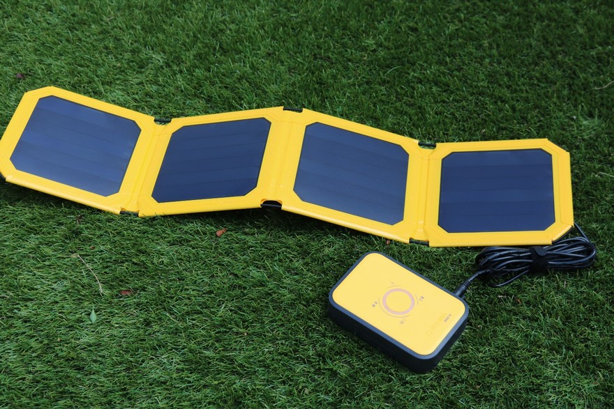
Battery whinges aside, what differentiates the Base 10 from other batteries is the solar charging option, and I was a little suspicious of the claims that the battery could be recharged by a day of sunlight (so long as temperatures stay between 0 and 50 degrees Celsius – so Arctic explorers and Death Valley campers need not apply).
However, I’m pleased to report that after a full day under an overcast British August day, the battery was indeed charged (although I estimate that it took pretty much every daylight hour). Things fared much better on sunnier days and in sunnier climates – during a sunny day in the Southern US state of Georgia, the battery reported a full charge after about 7 hours. This is turn provided a day of free power for my iPhone.
I did not try the solar panel on damp days, and I’m not sure how well the circuitry would hold up in a rainstorm. Waka Waka do not explicitly say it cannot be used, but do suggest avoiding submerging anything in water.
The panels themselves fold down relatively flat for packing away in the supplied pouch, although the cable soon became an irritant – a better cable tidy would be useful.
Illumination
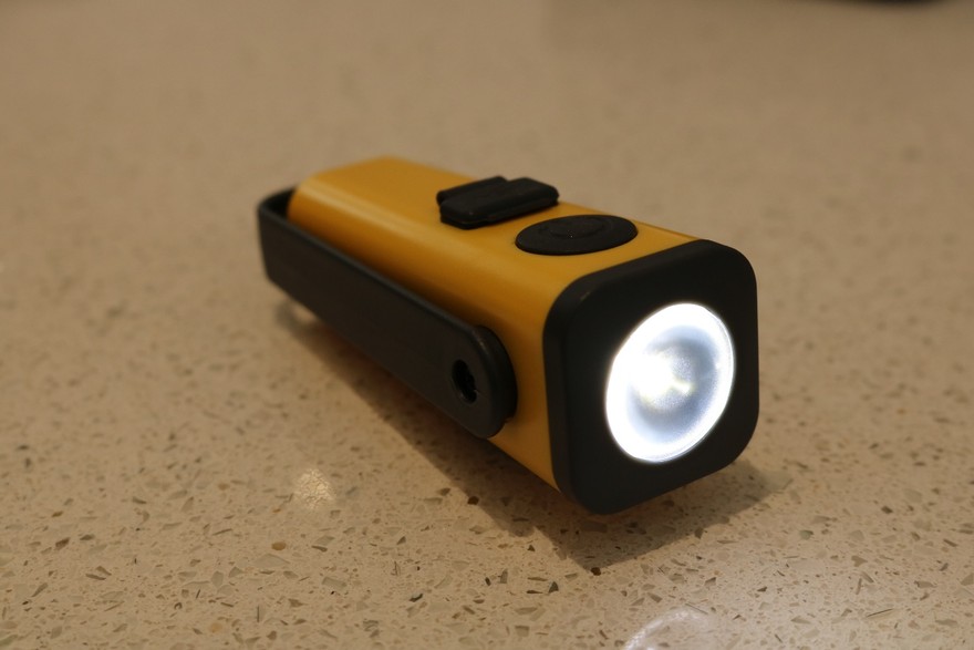
An unexpected bonus in the box, and something I found myself using more than I expected, were the torches. There are two in the pack, one rechargeable and one that runs directly off the battery. The torches allow two levels of brightness (for power saving) and can be daisy chained from the dedicated socket on the battery pack using the supplied cables (only the supplied cables can be used). Both torches have a folding stand for positioning (although something to clip it to a book would also be useful) and the rechargeable torch has a claimed life of up 15 hours on its dimmest setting (the brightest mode burned through the torch’s battery in less than 2 hours). However, when connected to the battery pack, up to 240 hours is apparently possible. In my testing, I didn’t manage to run down the battery over several nights of normal usage. Impressive stuff.
Conclusion
While perhaps a little on the pricey side, this is a very impressive system. I would have no hesitation in recommending it to anyone about to spend time away from convenient power socket and even to those who need a slightly more rugged battery pack. The solar panel and torches are surprisingly handy, and I have to confess to being somewhat reluctant to hand back the review unit.
Want to spoil Richard's day - you can win the review unit. Just tell us where you would use the waka waka and how long the battery on the torch lasts on its brightest setting. Enter Here - competition closes December 18th Judges decision final. Entrants must live in the EU.
Epson Ultra Short Throw LS100
Introduction
In the interest of full disclosure, I have to confess that I am a bit of a fan of projectors as part of a home cinema set up. I find it difficult to understand why people feel the need to bolt colossal TVs to a wall when a projector can produce an image larger than the most ambitious LCD screen on a conveniently blank wall.
 The Problem
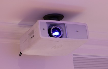
Of course, there are some very slight drawbacks to my preference. You have to be happy to have a beige box hanging from the ceiling at a height likely to behead a careless user. A projector will often pump out so much heat that a cinema room could double as an adhoc sauna. To get that big image on the wall, the projector needs to be set back as far as possible, which can present a problem in an average British house with average sized rooms (and Microsoft Kinect users know all about the problem of small rooms). And finally, the room needs to be dark; most projector users are more fixated on stray beams of sunlight than a vampire on a trip to Ibiza.
 The Solution
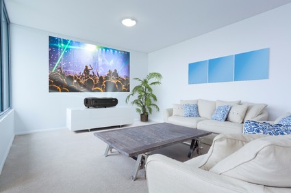
With the Ultra Short Throw LS100, Epson appear to have dealt with all the issues associated with using a projector and come up with a viable alternative to nailing a big TV to a wall as a way of getting that cinema experience. With one very big, 4K sized, proviso. More on that later.
Specifications
The EH-LS100 is a large, black box, and measuring 494mm wide and 437mm deep it is about the size of a large projector by modern standards. It weighs 11kg and consumes 423 watts at its highest power or 0.5 watts when in stand-by mode. It is relatively quiet for a projector, ranging from 39dB to 30dB. It also pumps out relatively little heat, certainly when compared to my old Sanyo, which I suspect features in the list of causes of global warming. This cool running is important when one considers that the LS100 can be placed less than 5cm from the wall on which the image is being projected (the theoretical minimum is 4.2mm).
The maximum screen size a user can expect is 130 inches, although 120 inches seems to be more realistic in everyday usage.
Epson pitch the LS100 as a replacement for a television, and with a brightness of 4,000 lumens, the image will still be visible even in a room beset by light. The 2,500,000:1 contrast results in rich, deep blacks.
In Use
The Ultra Short Throw LS100’s party trick is its ability to be placed against the wall to be used as the screen. Rather than the traditional lamp approach used by many projectors, Epson have opted for a laser source with an inhouse 3LCD technology (which means the headache-inducing rainbow effect found on wheel-based projectors is not a factor to worry about here). During the demonstration, I was impressed with the size of the screen with the projector sitting on what could be considered as a normal sideboard beneath the image. Coupled with the quietness of the device and the fact it remained cool to the touch, Epson have indeed addressed many of the issues associated with home projectors.
Since Epson have opted for a laser solution to achieve the impressive short throw distance, longevity is impressive, weighing in at 20,000 hours if run on full power or up to 30,000 hours if run in a less intensive eco mode. At over 10 years of normal use, this compares very favourably to what one would expect from a regular lamp-based projector, although it is not yet clear how one would replace the expired components at that point. In the meantime, Epson do include a 5-year return-to-base warranty, which should deal with any reliability concerns in the early years of the lifetime of the device.
4K or not 4K
There is no escaping the fact that this projector is HD and not 4K. It is a question that Epson have been asked a few times, judging by the slightly hunted look on the faces of the staff performing the demonstration. With 4K content now streaming from most of the online providers and Apple offering a 4K Apple TV with free upgrades to anyone who purchased HD content in the past, this is going to be an issue sooner rather than later. The HD image projected is gloriously bright and well-focussed, but there is no doubt that Epson’s engineering team are working feverishly on updating the Ultra Short Throw technology to support 4K content. In the meantime, anyone hoping to see their new Xbox One X rendering Forza in 4K on this projector are in for a bit of a disappointment (although it is fair to say that HD games look frankly stunning).
Conclusion
I was very impressed during my short time with the LS100. At £2500, if I were in the market for an HD projector, this would have to be near the top of the list just for the sheer convenience if nothing else. A truly vast screen can be conjured with no additional wiring or any of the aggravation of bolting a projector to the ceiling at the back of a room. In many ways, this projector brings the true potential of a real home cinema to the masses.
And, as an introductory offer to early adopters, Epson are also offering 2 annual cinema passes with every projector, which is vaguely ironic when one thinks about it.
However, the 4K issue cannot be ignored, and needs to be considered carefully. With an expected 10-year lifespan, it may be a while before a purchaser of the LS100 will be able to take advantage of newer, higher definition content. How much of a problem that becomes is down to personal preference.
The LS100 will be available in November 2017.
VR Lab
“You should probably leave that alone until after the show”
The bar at vrLAB, part of the 2017 Brighton Digital Festival, was well stocked and inviting. But the warning was well meant. Virtual Reality, if done badly, can be a dizzying experience at best and downright nauseating at worst. The beer would have to wait.
Located in a performance space within the Old Market theatre in Hove, vrLAB consisted of a large number of exhibits ranging from interactive art installations, through training and educational tools to immersive gaming experiences. After a discussion about the current state of Virtual and Augmented Reality with one of the event’s sponsors, make[REAL], it was time to try out some of the toys.
Loco Dojo
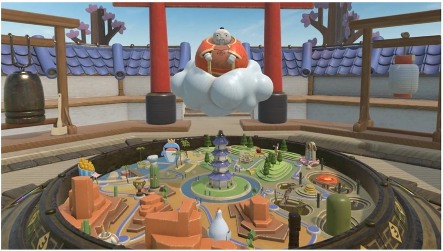
Dominating one wall of the space was a large screen and four Oculus headsets demonstrating Loco Dojo, a party game developed by make[REAL]. Set in a cartoonish world and liberally sprinkled with humour, players take part in 16 mini games that take full advantage of the Oculus hardware, from ducking to avoid leaping sharks (demonstrating the impressive motion tracking abilities of the sensors) through to flinging food around using the Touch controllers. Having the mighty Brian Blessed provide narration to the player in his signature style only adds to the insanity and hilarity of the whole experience.
The immersive nature of the game was impressive with details that begged for a closer look, such as the intricate ‘wheel of fortune’-style hub used to select the next mini-game. The attention to detail is such that the player is tempted to lean over to peer into the world within.
With it’s bright, Saturday morning cartoon visuals and instant and universal playability, the Loco Dojo exhibit was popular throughout the session, with players limited to 10 minutes of play and an attendant working hard to ensure players did not accidentally pull any expensive hardware off tables during a particularly exciting bit of gameplay. The Oculus, like the Vive, requires a cable connection to a gaming PC, and getting tangled in wires while immersed in the world of Loco Dojo is a definite possibility.
As Ben Dykes of make[REAL] observed, the next challenge for headset makers is going to be finding a way to get rid of that cable.
Doctor Nuclear
Party games aside, one area where VR has been quietly making inroads over the last few years is in education and training. An introduction to what makes a nuclear power station (built for the energy giant EDF) was attracting interest. What would have been a lengthy and tedious presentation is transformed into a puzzle game using the HTC Vive. Once the headset is on, the player is presented with a picture of a completed nuclear reactor on a wall and various components scattered on the virtual floor below. Using the Vive’s hand controllers, the player then reaches out and connects parts together, with connectors lighting up when aligned. Passing components from hand to hand and turning them in the virtual space rapidly became second nature and with a shower of confetti I had built my first reactor.
My delight was short lived as I looked up to see level 2 hovering overhead – a considerably more complicated design to put together. As with Loco Dojo, taking time to take a closer look and walk around the model was irresistible. However, also like Loco Dojo, an attendant was on hand to guide the cable and ensure that my wanderings didn’t result in a powerful gaming PC experiencing a rapid unplanned disassembly upon contact with the floor.
Addiction
Away from the complicated interactivity of the Oculus and Vive-based exhibits were technically simpler experiences based on Google Cardboard or Daydream or Samsung Gear. Utilising 360 degree video with interaction limited to staring at a fixed point or ‘hotspot’ in the display to jump to the next film, these devices represent a cost effective way of immersing the user in a virtual world.
Following a personal tragedy, Elvar Sig spent 12 months creating the very moving ‘Inside the Addicted Mind’, a sequence of 3 cautionary tales ending with a final summary. The simplicity of the experience belies the 12 months of effort put into the project by the photography student, utilising a normal digital camera, Photoshop and Premiere Pro to stitch together the scenes.
The result is a set of immersive films where the viewer can only look on helplessly as the characters make a sequence of seemingly minor decisions that eventually combine into potential disaster. Subtle use is made of motion tracking as the viewer can look to the left, right and behind as characters consider the possible outcomes as well as following a character through the various scenes, from a student bedroom to a family apartment. The visuals are utterly convincing, with an absorbing animation technique rather than traditional video.
The experience of viewing the characters’ journeys through alcoholism, painkiller addiction and so on was moving and thought-provoking and something that I would recommend to anyone. And with such a low cost entry point, this would likely be a better way of engaging and educating children and students without recourse to patronising or dull monologues.
Racing on Pasta
Time had flown, and with only a two hour slot in the vrLAB exhibition (to spread out visitors and give exhibitors time to recharge headsets and controllers) I had time for one more experience. I have to confess to being a bit of a fan of Wipeout on the original PlayStation, and so was keen to try out a returnee from 2016 – the Oculus-based Radial-G.
Of all the things I tried, this was the one that I was most concerned about in terms of motion sickness, since in this game it is all about the speed. Set on a race track of tubes and strips of mechanised tagliatelle, the player faces off against a number of racers with various options for weapons and speed boosts. And, to be frank, speed boosts are what this game is all about. With the Oculus headset, the player is completely immersed in the frantic game world. I quickly forgot about my competitors as I focussed on getting to the next boost to scream around the track as quickly as possible. Those looking for a complete Wipeout-style experience might be a bit disappointed, since the game is a bit sparse if one scratches beneath the surface, but as a pick-up and go VR racer the experience is something to behold.
Too Much To Do
I had run out of time. BBC Learning had an exhibit where a player could take a spacewalk around the International Space Station using the HTC Vive (although while watching it on screen, I was disappointed to see a fair few issues with clipping where the astronaut managed to put his hands through the hull of the space station – a bad day in the non-virtual world!). The BBC also had a Google Cardboard-based documentary following the events of the 1916 Easter Uprising through the memories of a witness to the event. Other exhibits included a noir-ish detective game, virtual galleries and painting and tools to educate on environmental issues. Packing all the exhibition had to offer into a short two hour window would present a challenge for even the most organised attendee.
Conclusion
There is no doubt that Virtual Reality is here to stay. The headsets are lightweight and the visuals far more convincing than the ‘Money For Nothing’ style polygons of the 1980s. Every person I saw take a spin on Loco Dojo or have a float in a virtual space suit came away awestruck. I suspect that there may have been a number of purchases of VR hardware by a few attendees, from a Google Cardboard box to a full Oculus set-up.
I remain very impressed by the breadth of applications – from the games and learning tools shown off by make[REAL] through to Elvar Sig’s cautionary tales. And to repeat Ben Dykes’ observation, the challenge for hardware makers now is to follow the lead of Microsoft with the HoloLens and dispense with the cables.
And no, not one of the VR experiences left me nauseous. Next time I’ll take that beer.
You can learn more about the work of Elvar Sig here: https://www.addictedmind.net/
More details can be found here: http://brightondigitalfestival.co.uk/
make[REAL],
Meeting the people behind Virtual Reality
Virtual Reality (or VR) feels very much like a technology whose time has come. The giant headsets of the past that felt like an elephant was sitting on your head are very much a distant memory, with lightweight high definition eyewear from the likes of Oculus (now part of the Facebook empire) and HTC leading the way in immersive interactive entertainment, while Google Cardboard and Samsung’s Gear represent a low-cost entry into the world of 360-degree video. And then there is Microsoft’s HoloLens, which still commands an impressive lead in Augmented Reality, despite advances from Google and Apple.
Making it [REAL]
make[REAL], a Brighton-based company, are surfing this wave of interest with a wide variety of VR applications for education, visualisation and, of course, entertainment, over most of the current platforms. I spent some time with Ben Dykes and Sam Watts of make[REAL] during the vrLAB event at the Brighton Digital Festival to learn more about the current state of the art in VR and where things are likely to go next.
Ben’s background is in flight simulation; creating the countryside and vistas viewed from the cockpit windows. However, at the time of the formation of make[REAL]’s parent company, Makemedia, the technology to bring that sort of fidelity to the consumer market had yet to arrive. It took until the Oculus Rift Kickstarter campaign and the delivery of the first developer kits to bring true virtual reality to the masses.
Crossing the platforms
make[REAL] is not focussed on a single hardware platform, using the Unity framework to bring interactive experiences to the HTC Vive and HoloLens as well as the Oculus Rift. The tight-knit company’s skills have resulted in an impressive roster of clients, including McDonalds and EDF energy, all excited to leverage emerging technologies in education, marketing and brand-building.
Nuclear Ambitions
One striking example of this is the work being done using the Microsoft HoloLens. Unlike the Rift or Vive, which are fully enclosed headsets, the HoloLens overlays the world around the user with imagery. The hardware is impressive, there are no cables to trip over and no gaming PC required. Everything is contained within a lightweight headset, with 3D sound enhancing the experience. make[REAL] have used the HoloLens to create a model of the proposed Hinkley Point C power station, and seeing the site in miniature, sat on the pool table in the make[REAL] offices was somewhat surreal! I spent quite some time walking around the table, leaning in for a close look at some of the buildings and dodging seagulls (a recurring theme for make[REAL] – this is a Brighton company after all!). Using the pinch selection method of the HoloLens, additional information about the facility could be learned. As a way of visualising a structure, I think this is pretty much unbeatable and considerably more practical than creating physical models to carry around to presentations.
California Dreaming
Ben then switched the HoloLens to show a proof of concept developed by the company to show off the capabilities of the hardware. This time, a detailed 3D model of San Francisco appeared on the pool table with a simulated real-time feed of shipping movements in the harbour. I have to confess, while the live transits of the container ships were impressive, I spent much more time peering down the rendered streets below me like a creature from a Japanese monster movie. It is clear that as a business tool, the HoloLens makes a great case for itself and it will be interesting to see where Microsoft goes with the next version.
Of course, Microsoft is not the only game in town. Google’s Glass made a brief and unfairly derided appearance a few years ago. As with the HoloLens, the real strength comes from the business applications that arise from having a hands-free device that can overlay instructions, guidance and training on top of what the user is seeing.
While Augmented Reality is trickling into the mainstream, full Virtual Reality is very much a, er, reality.
Potato Farming
Sam Watts took me through an example of work done for McDonalds aimed at inspiring young farmers to get involved in the industry, educate users on what is involved in food production while also entertaining and doing a bit of image building along the way. Consisting of a sequence of 360 degree videos and then an interactive potato farming game (yes, tractor driving is involved) the experience had a number of challenges, both technical and physical. Motion sickness can be an issue, particularly amongst older users due to thickening of the inner ear with age, so care had to be taken not to make the tractor driving too realistic. Too much bouncing on the seat might result in a bout of nausea. However, the adjustment of making the visuals smoother when the player was driving on the correct tracks but bouncier if the wrong course was taken, has given an educational bonus – don’t drive over the potatoes! The physical challenge was the nature of the then very new Oculus Rift technology and the gaming PCs needed to support it. Would it survive sunshine and shower country-fair conditions? How long could the cables be? In the end, and combined with Samsung Gear VR’s for the video portion of the experience, the project proved to be a great success.
More recent developments by the clever people at make[REAL] have included the Vive-based EDF nuclear plant jigsaw puzzle along with two pure game developments – the racer Radial-G (which was derived from a booth attractor for RS Components) and party game, Loco Dojo. Check out my write up of vrLAB at the Brighton Digital Festival to find out how I got on with all three.
Parallels Desktop 13
Introduction
Parallels Desktop has been
around for a few years now, launching in 2006 as a way of bringing Windows
virtual machines to Mac desktops. Over
the years, the capabilities of the product have increased with new features and
improved performance, and version 13 (which launched in August 2017) continues
that evolution.
Until virtualisation
technologies, such as Parallels Desktop, arrived the only option for getting
Windows running on an Intel-based Apple Mac was a utility called Bootcamp. This somewhat convoluted tool
required the creating of partitions and rebooting the Mac in order to switch
operating systems. Bootcamp
remains part of the OSX suite to this day and while it has the benefit of being
free (other than the cost of the Windows licence) it is not fun to use, and for
this reviewer at least, has resulted in having to restor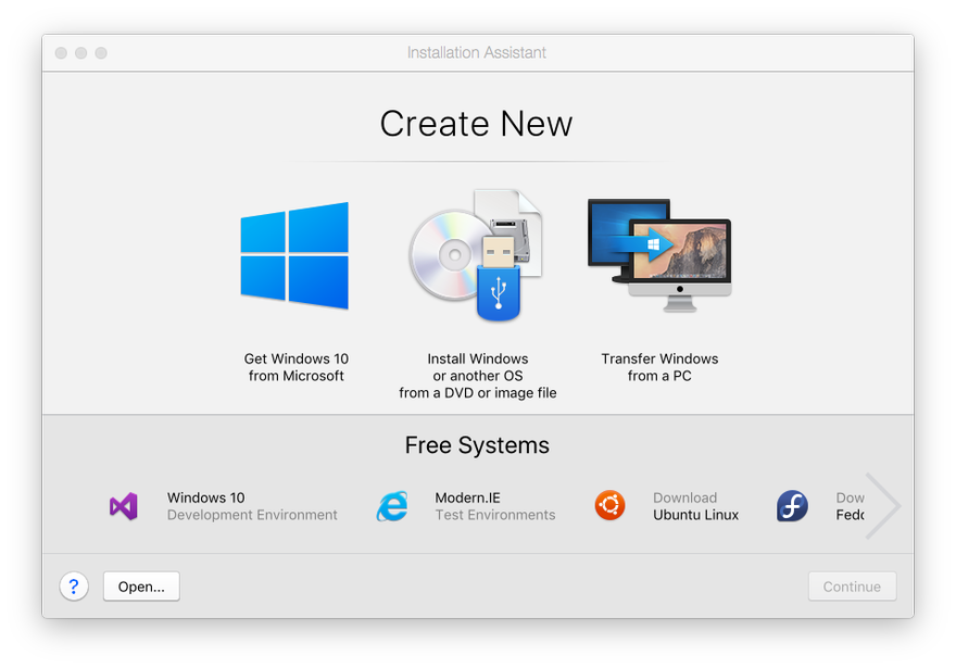 e OSX from a backup on
a number of occasions. Suffice
to say, it is not a great solution.
 e OSX from a backup on
a number of occasions. Suffice
to say, it is not a great solution.
e OSX from a backup on
a number of occasions. Suffice
to say, it is not a great solution.Parallels Desktop allows a full
installation of Windows (or other virtualised operating system) to run on the
OSX desktop in a window of its own, and over the years Parallels has added functions
such as clipboard sharing and the ability to pin Windows applications to the
Mac dock.
Setting Up
Installation is straightforward,
and this theme of simplicity continues into the creation of the virtual
machines. Opening the Parallels Control
Center allows for a number of machine types to be set up, with the core Windows
install front and centre.
The setup process has been further
simplified in version 13 – previous incarnations required a user to provide an
ISO image of Windows themselves. With
the new version, this can be downloaded directly from Microsoft (although you
will obviously need a Windows licence key at some point.) Parallels also supports a variety of free
operating systems, from the most popular flavours of Linux to Android 7. Again, setting these up is made simple with
Parallels downloading the necessary distributions automatically. With an eye to the developer community,
Parallels has also provided 90-day trial versions of various pre-canned
versions of Windows such as IE11 on Windows 8.1, IE9 on Windows 7 and so on.
For the purposes of this review,
I will be concentrating on the features available within the Windows 10 virtual
machine.
In Use
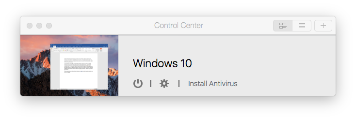
The Parallels Control Center is
little changed in version 13, showing a list of available virtual machines with
a preview of the current running session.
The screen-shot below shows the Microsoft session Word session being
used to create this article.
As well as creating additional
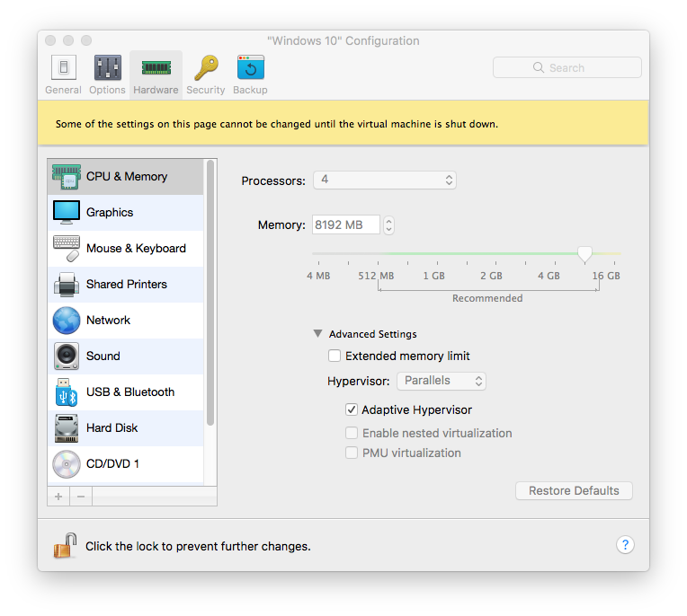
virtual machines, the Control Center allows existing setups to be configured to
use specific amounts of system resources, allowing for up to 32 CPU cores and
128GB RAM per VM in the Pro edition (and if you’ve spent more money on Apple
hardware than NASA did to land on the moon.)
Access to USB, CD or DVD drives and other hardware resources such as
disk space can also be configured, as well as enabling video acceleration for
graphics, and again, this does depend on what your Mac has available. In my testing, I encountered no problems with
this pass-through of resources and was able to access attached storage and USB
devices such as webcams or headsets without difficulty.
It is also possible to configure
the access the virtual machine will have to the underlying OSX install and vice
versa, including clipboard and file sharing.
Once configured, using the
Windows 10 installation is spookily simple.
As yet, I have not encountered any compatibility issues and have
installed games, used Windows Insider builds of Windows 10 and all manner of
applications with no problems other than the fan on my 2012 Mac Mini spinning
up when Windows is doing something particularly taxing. As such, I would not recommend doing too much
work on a battery powered laptop.
Making it Coherent
While the virtual machine may be
run in a window (leaving the OSX desktop visible) or full screen mode (making
your shiny Mac resemble a lowly Windows 10 PC, except with a vaguely irritating
keyboard) some may have a particular application for which they need to use
Windows 10 and would rather not have the slightly jarring effect of watching
Windows 10 boot up in a window on the desktop.
For these users, there is
Coherence mode. This mode will allow a well-behaved
application within Windows 10 to run in its own window on the OSX desktop
without any sign of Windows 10 itself.
For all intents and purposes, the Windows application behaves like an
OSX application, except with all the Windows-style dialogs and widgets that are
bound to make a committed Mac fan wail.
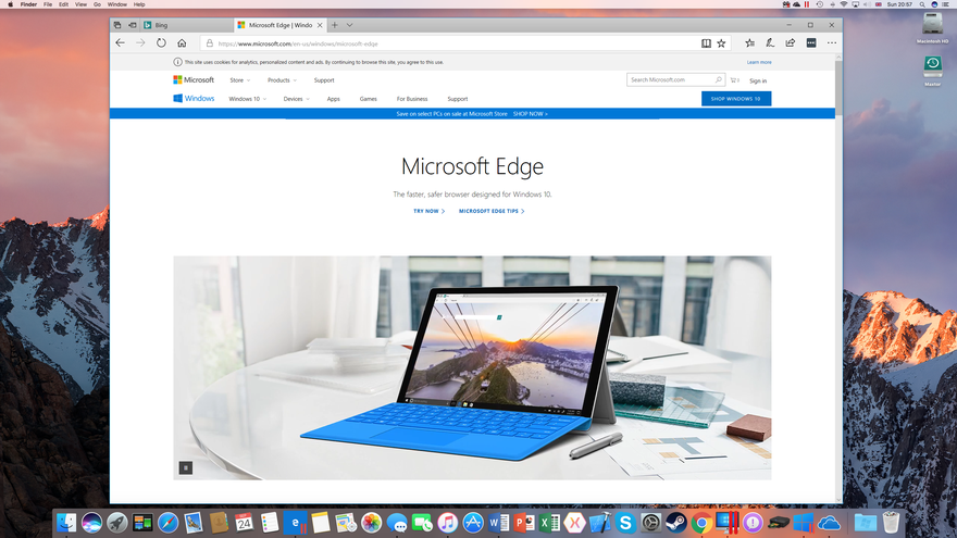
Since I doubt we will see the
Microsoft Edge browser running in OSX any time soon, I tried it first and was
very impressed with how seamless the experience was. I had the same experience with the Office
applications and Visual Studio. Menus
transition seamlessly, system resource sharing works as expected and even the
application icon appears in the OSX desktop dock as though it was a fully paid
up member of the Mac ecosystem.
This is very impressive stuff
and eases the transition for Windows users who are migrating to the Apple
ecosystem but still have some native Windows applications they cannot live
without.
New in 13
Parallels updates at least once
a year and aside from the bump in vCPU and vRAM availability mentioned above,
there are some additional toys for users of previous versions.
Firstly, file performance has
been increased, with around 50% increases in performance across the board and
100% increase (up to near native speed) for external Thunderbolt SSD’s. I have to confess that subjectively, I didn’t
really notice these increases since I have found file access in my VM’s to be
more than acceptable, but those shovelling large amounts of disk-based data
will appreciate the improvements.
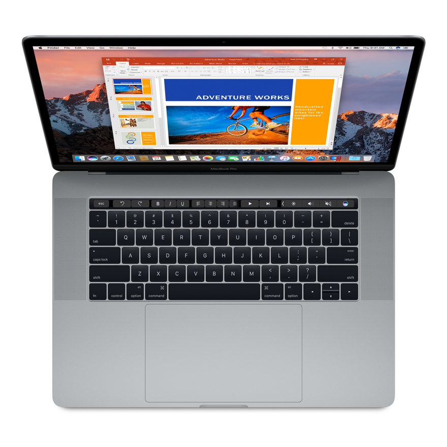
Those using MacBook Pros with
Touch Bars will appreciate that it is now possible to assign functions within
Windows office applications to the Touch Bar.
Unfortunately, I was unable to test this functionality on my older Mac Mini. I will revisit this if I get my hands on a
Touch Bar-enabled Mac.
With Macs gradually finding
their way into the corporate world, IT administrators will be pleased to find
Single Application mode, which allows an invisible virtual machine with specific
Windows application to be added to a user’s Dock.
The last couple of notable
features are a little more cosmetic, with better support for retina displays
allowing for sharper text within Virtual Machines and a nod to the current
implementation of the Windows 10 People Bar (due to ship in the Fall Creators
Update) – those contacts can also be added to the Mac Dock.
Tooled Up
Also available as a separate
product, the Parallels Toolbox has had some enhancements as well. A collection of useful utilities, the
Parallels Toolbox is a handy thing to have for users that do not want the
hassle of seeking free versions elsewhere, and with a common interface
throughout, will make the lives of novice users easier.
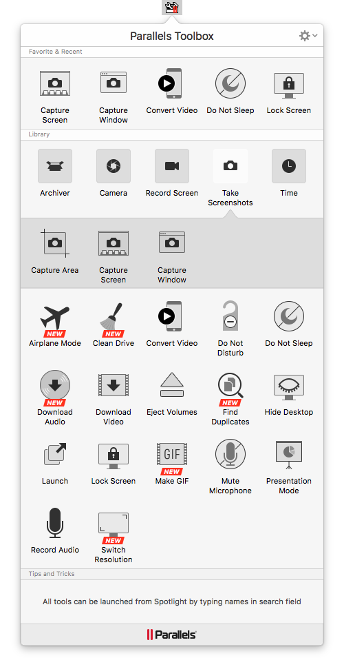
Added to the comprehensive suite
of screenshot, screen recording and general desktop management tools are new
functions to clean up disk space, create GIF’s, download audio from a URL,
quickly switch resolution and quieten OSX for presentation purposes (a boon to
anyone who has ever had an annoying notification pop up during a
demonstration.)
Conclusion
If you do not already have
Parallels Desktop and want to run Windows 10 applications, then I have no
hesitation in recommending it. During my
time with it, Parallels Desktop has proved more stable than Windows 10 itself,
and even OSX, and I have yet to encounter any compatibility issues.
However, if you are a Parallels
12 user then the story is less clear and you should consider carefully if the
additional CPU and RAM support, faster disk access and cosmetic enhancements
make it worthwhile. I should point out
that I was able to upgrade all my existing version 12 VM’s to version 13 with
no difficulties, but the value proposition is something that should be
considered carefully before upgrading.
Parallels Desktop 13 currently
retails at £69.99 for the Home and Student Edition or £79.99 for the Pro and
Business Editions. Parallels also offers
annual subscription options. Check out https://www.parallels.com for more details.
Wow - our ears get a treat from Riva Audio | Ruth looks at a toy that encourages logic skills in children and a lot more | |||
Lots of great content | We look at the evolving world of Vehicle technology with the Toyota C-HR plus the Engie Diagnostic Device. The Cubetto also featured on the cover can be found in Ruth's Reviews | Back to the cover |